Flowbite
- 추천0
- GitHub 별9.4K
- UI/UX라이선스MIT
Tailwind CSS 위에 만든 UI 컴포넌트·플러그인 모음. 모달·내비바·폼 같은 부품을 HTML 속성만으로 움직여요
요약
Tailwind CSS 위에 만든 UI 컴포넌트·플러그인 모음. 모달·내비바·폼 같은 부품을 HTML 속성만으로 움직여요
설명

Tailwind CSS 위에 만든 컴포넌트로 웹사이트를 더 빠르게 만드세요


목차
- 목차
- 문서
- 시작하기
- npm으로 설치
- CDN으로 포함
- 번들된 JavaScript
- 데이터 속성
- 초기화 함수
- ESM과 CJS
- TypeScript
- RTL 지원
- JavaScript 프레임워크
- 백엔드 프레임워크
- 컴포넌트
- Figma 디자인 시스템
- Flowbite Blocks
- Flowbite Icons
- Flowbite GPT
- Pro 버전
- 우리와 함께하기
- 디자인 개념 배우기
- 커뮤니티
- 저작권과 라이선스
문서
전체 문서는 flowbite.com에서 확인하세요.
시작하기
Flowbite는 기존 Tailwind CSS 프로젝트에 플러그인으로 넣을 수 있습니다. Tailwind CSS의 유틸리티 클래스로 만든 웹 컴포넌트 모음을 제공해 웹사이트를 더 빠르게 만들도록 돕습니다.
npm으로 설치
Node.js와 Tailwind CSS가 설치되어 있는지 확인하세요. 이 가이드는 Tailwind v4 기준입니다.
- 다음 명령으로 npm을 통해 Flowbite를 의존성으로 설치합니다.
npm install flowbite
- 메인
input.cssCSS 파일 안에서 Flowbite의 기본 테마 변수를 가져옵니다.
/* 다음 중 하나를 고르세요 */

@import url('https://fonts.googleapis.com/css2?family=Inter:wght@300;400;500;600;700;800&display=swap');
@import "flowbite/src/themes/default";

/* MINIMAL THEME
@import url('https://fonts.googleapis.com/css2?family=Open+Sans:ital,wght@0,300..800;1,300..800&display=swap');
@import "flowbite/src/themes/minimal";
*/

/* ENTERPRISE THEME
@import url('https://fonts.googleapis.com/css2?family=Shantell+Sans:ital,wght@0,300..800;1,300..800&display=swap');
@import "flowbite/src/themes/enterprise";
*/

/* PLAYFUL THEME
@import url('https://fonts.googleapis.com/css2?family=Google+Sans+Code:ital,wght@0,300..800;1,300..800&display=swap');
@import "flowbite/src/themes/playful";
*/

/* MONO THEME
@import "flowbite/src/themes/mono";
*/
- CSS에서 Flowbite 플러그인 파일을 가져옵니다.
@plugin "flowbite/plugin";
- CSS에서 Flowbite의 소스 파일을 설정합니다.
@source "../node_modules/flowbite";
- 인터랙티브 요소를 움직이게 하는 JavaScript 코드를
</body>태그가 끝나기 전에 넣습니다.
<script src="../path/to/flowbite/dist/flowbite.min.js"></script>
Flowbite JavaScript API와 기능은 JavaScript 절에서 더 알아보세요.
Tailwind CSS v3를 쓰는 오래된 프로젝트가 있다면 이 가이드에서 v4로 올리는 방법을 확인하세요.
CDN으로 포함
Flowbite로 가장 빨리 시작하는 방법은 CDN으로 CSS와 JS를 프로젝트에 넣는 것입니다.
head 태그 안에 다음 압축 스타일시트를 넣으세요.
<link href="https://cdn.jsdelivr.net/npm/flowbite@{{< current_version >}}/dist/flowbite.min.css" rel="stylesheet" />그리고 body 요소가 끝나기 전에 다음 JavaScript 파일을 넣으세요.
<script src="https://cdn.jsdelivr.net/npm/flowbite@{{< current_version >}}/dist/flowbite.min.js"></script>Tailwind CSS와 Flowbite를 함께 쓰는 가장 좋은 방법은 쓰지 않는 CSS 클래스를 걷어내는(purge) 것임을 기억하세요.
번들된 JavaScript
Flowbite를 가장 많이 쓰는 방법 중 하나는 UMD를 지원하는 번들 JavaScript 파일을 넣는 것입니다. Webpack이나 Parcel 같은 번들러를 쓰면 모든 데이터 속성과 기능이 바로 동작합니다.
번들된 app-bundle.js 파일 안에서 메인 JavaScript 파일을 다음처럼 직접 가져올 수 있습니다.
import 'flowbite';이 파일은 모든 컴포넌트에 접근할 수 있고, 데이터 속성에 이벤트 리스너를 자동으로 붙입니다.
데이터 속성
Flowbite의 인터랙티브 UI 컴포넌트를 쓰는 권장 방법은 데이터 속성 인터페이스입니다. HTML 요소 속성으로 기능을 더할 수 있게 해 주며, 문서의 대부분 예제가 이 방식을 씁니다.
예를 들어 모달 컴포넌트를 설정하려면 data-modal-target과 data-modal-{toggle|show|hide}를 쓰면 됩니다. 어떤 트리거 요소를 클릭해도 컴포넌트를 토글하거나 보이거나 숨길 수 있습니다.
<button data-modal-target="defaultModal" data-modal-toggle="defaultModal" class="block text-white bg-blue-700 hover:bg-blue-800 focus:ring-4 focus:outline-none focus:ring-blue-300 font-medium rounded-lg text-sm px-5 py-2.5 text-center dark:bg-blue-600 dark:hover:bg-blue-700 dark:focus:ring-blue-800" type="button">
  Toggle modal
</button>

<!-- Main modal -->
<div id="defaultModal" tabindex="-1" aria-hidden="true" class="fixed top-0 left-0 right-0 z-50 hidden w-full p-4 overflow-x-hidden overflow-y-auto md:inset-0 h-[calc(100%-1rem)] max-h-full">
    <div class="relative w-full max-w-2xl max-h-full">
        <!-- Modal content -->
        <div class="relative bg-white rounded-lg shadow-sm dark:bg-gray-700">
            <!-- Modal header -->
            <div class="flex items-start justify-between p-4 border-b rounded-t dark:border-gray-600 border-gray-200">
                <h3 class="text-xl font-semibold text-gray-900 dark:text-white">
                    Terms of Service
                </h3>
                <button type="button" class="text-gray-400 bg-transparent hover:bg-gray-200 hover:text-gray-900 rounded-lg text-sm p-1.5 ml-auto inline-flex items-center dark:hover:bg-gray-600 dark:hover:text-white" data-modal-hide="defaultModal">
                    <svg aria-hidden="true" class="w-5 h-5" fill="currentColor" viewBox="0 0 20 20" xmlns="http://www.w3.org/2000/svg"><path fill-rule="evenodd" d="M4.293 4.293a1 1 0 011.414 0L10 8.586l4.293-4.293a1 1 0 111.414 1.414L11.414 10l4.293 4.293a1 1 0 01-1.414 1.414L10 11.414l-4.293 4.293a1 1 0 01-1.414-1.414L8.586 10 4.293 5.707a1 1 0 010-1.414z" clip-rule="evenodd"></path></svg>
                    <span class="sr-only">Close modal</span>
                </button>
            </div>
            <!-- Modal body -->
            <div class="p-6 space-y-6">
                <p class="text-base leading-relaxed text-gray-500 dark:text-gray-400">
                    With less than a month to go before the European Union enacts new consumer privacy laws for its citizens, companies around the world are updating their terms of service agreements to comply.
                </p>
                <p class="text-base leading-relaxed text-gray-500 dark:text-gray-400">
                    The European Union’s General Data Protection Regulation (G.D.P.R.) goes into effect on May 25 and is meant to ensure a common set of data rights in the European Union. It requires organizations to notify users as soon as possible of high-risk data breaches that could personally affect them.
                </p>
            </div>
            <!-- Modal footer -->
            <div class="flex items-center p-6 space-x-2 border-t border-gray-200 rounded-b dark:border-gray-600">
                <button data-modal-hide="defaultModal" type="button" class="text-white bg-blue-700 hover:bg-blue-800 focus:ring-4 focus:outline-none focus:ring-blue-300 font-medium rounded-lg text-sm px-5 py-2.5 text-center dark:bg-blue-600 dark:hover:bg-blue-700 dark:focus:ring-blue-800">I accept</button>
                <button data-modal-hide="defaultModal" type="button" class="text-gray-500 bg-white hover:bg-gray-100 focus:ring-4 focus:outline-none focus:ring-blue-300 rounded-lg border border-gray-200 text-sm font-medium px-5 py-2.5 hover:text-gray-900 focus:z-10 dark:bg-gray-700 dark:text-gray-300 dark:border-gray-500 dark:hover:text-white dark:hover:bg-gray-600 dark:focus:ring-gray-600">Decline</button>
            </div>
        </div>
    </div>
</div>
초기화 함수
초기화 함수를 써서 이벤트 리스너를 직접 설정할 수도 있습니다. 다음은 Vue나 Nuxt에서 하는 예입니다.
<script setup>
import { onMounted } from 'vue'
import { initFlowbite } from 'flowbite'

// 데이터 속성 선택자를 기준으로 컴포넌트를 초기화합니다
onMounted(() => {
    initFlowbite();
})
</script>

<template>
    // Flowbite의 데이터 속성이 붙은 모달 HTML 마크업
</template>
initFlowbite 함수는 드롭다운, 모달, 내비바, 툴팁 등의 모든 초기화 함수를 데이터 속성에 연결해 줍니다. 컴포넌트 범주별로 initDropdowns나 initModals처럼 따로 초기화할 수도 있습니다.
Flowbite의 컴포넌트를 둘러보면 더 많은 예제를 볼 수 있습니다.
ESM과 CJS
Flowbite는 컴포넌트를 프로그램 코드로 다루는 API도 제공하며, JavaScript의 CJS와 ESM을 모두 지원합니다. 데이터 속성 인터페이스의 기본 기능을 확장하거나 함수 콜백에 접근해야 할 때 도움이 됩니다.
다음은 JavaScript 안에서 새 Modal 컴포넌트를 가져와 만드는 예입니다.
import { Modal } from 'flowbite'

const $modalElement = document.querySelector('#modalEl');

const modalOptions = {
    placement: 'bottom-right',
    backdrop: 'dynamic',
    backdropClasses: 'bg-gray-900/50 dark:bg-gray-900/80 fixed inset-0 z-40',
    onHide: () => {
        console.log('modal is hidden');
    },
    onShow: () => {
        console.log('modal is shown');
    },
    onToggle: () => {
        console.log('modal has been toggled');
    }
}

const modal = new Modal($modalElement, modalOptions);

modal.show();
사용법은 각 컴포넌트 페이지의 JavaScript 동작 절에서 확인하세요.
TypeScript
Flowbite는 인터랙티브 UI 컴포넌트에 대한 타입 선언(객체 인터페이스와 매개변수 타입 포함)을 지원합니다. 다음 예제로 Flowbite에서 타입을 쓰는 방법을 확인하세요.
위 코드에 더해, 이제 Flowbite 패키지에서 ModalOptions와 ModalInterface라는 관련 타입을 가져옵니다.
import { Modal } from 'flowbite'
import type { ModalOptions, ModalInterface } from 'flowbite'

// 나머지 코드
일반적으로 모든 컴포넌트에는 인터페이스 정의가 있어, 새 객체를 만들 때 올바른 매개변수와 메서드 타입을 쓰는지 확인할 수 있습니다.
새 모달을 만들 때 ModalInterface를 주 타입으로 지정할 수 있습니다.
const modal: ModalInterface = new Modal($modalElement, modalOptions);Flowbite는 옵션 객체의 타입 정의도 지원하므로, 타입을 기준으로 모달의 위치를 정하려면 다음처럼 하면 됩니다.
const modalOptions: ModalOptions = {
    placement: 'top-right'
}

const modal: ModalInterface = new Modal($modalElement, modalOptions);
Flowbite와 TypeScript는 빠른 시작 가이드에서 더 알아보세요.
RTL 지원
Flowbite의 모든 UI 컴포넌트는 RTL(오른쪽에서 왼쪽 쓰기)을 기본 지원하며, HTML 요소에 dir="rtl" 속성을 쓰면 쉽게 설정할 수 있습니다. Flowbite와 RTL 지원은 여기에서 더 읽어 보세요.
JavaScript 프레임워크
훌륭한 오픈소스 커뮤니티가 React, Vue, Svelte, Angular, Qwik용 독립 라이브러리를 만들어 지금도 관리하고 있습니다.
- 🌀 Flowbite React 라이브러리
- 🍀 Flowbite Vue 라이브러리
- 🎸 Flowbite Svelte 라이브러리
- 📕 Flowbite Angular 라이브러리
- 👿 Flowbite Qwik 라이브러리
다음 프런트엔드 프레임워크와 라이브러리용 연동 가이드도 썼습니다.
- 📝 Flowbite와 React 가이드
- 📝 Flowbite와 Next.js 가이드
- 📝 Flowbite와 Remix 가이드
- 📝 Flowbite와 Vue 가이드
- 📝 Flowbite와 Nuxt 가이드
- 📝 Flowbite와 Svelte 가이드
- 📝 Flowbite와 Astro 가이드
- 📝 Flowbite와 MeteorJS 가이드
- 📝 Flowbite와 Gatsby 가이드
- 📝 Flowbite와 SolidJS 가이드
- 📝 Flowbite와 Qwik 가이드
- 📝 Flowbite와 TypeUI 가이드
백엔드 프레임워크
Flowbite는 순수 JavaScript에 기반하기 때문에 대부분의 백엔드 프레임워크와 잘 연동됩니다.
- 📚 Laravel에서 Flowbite 쓰기
- 🎼 Symfony에서 Flowbite 쓰기
- 🚊 Ruby on Rails 7에서 Flowbite 쓰기
- 🐉 Phoenix(Elixir)에서 Flowbite 쓰기
- 🐸 Django에서 Flowbite 쓰기
- 🌶 Flask에서 Flowbite 쓰기
컴포넌트
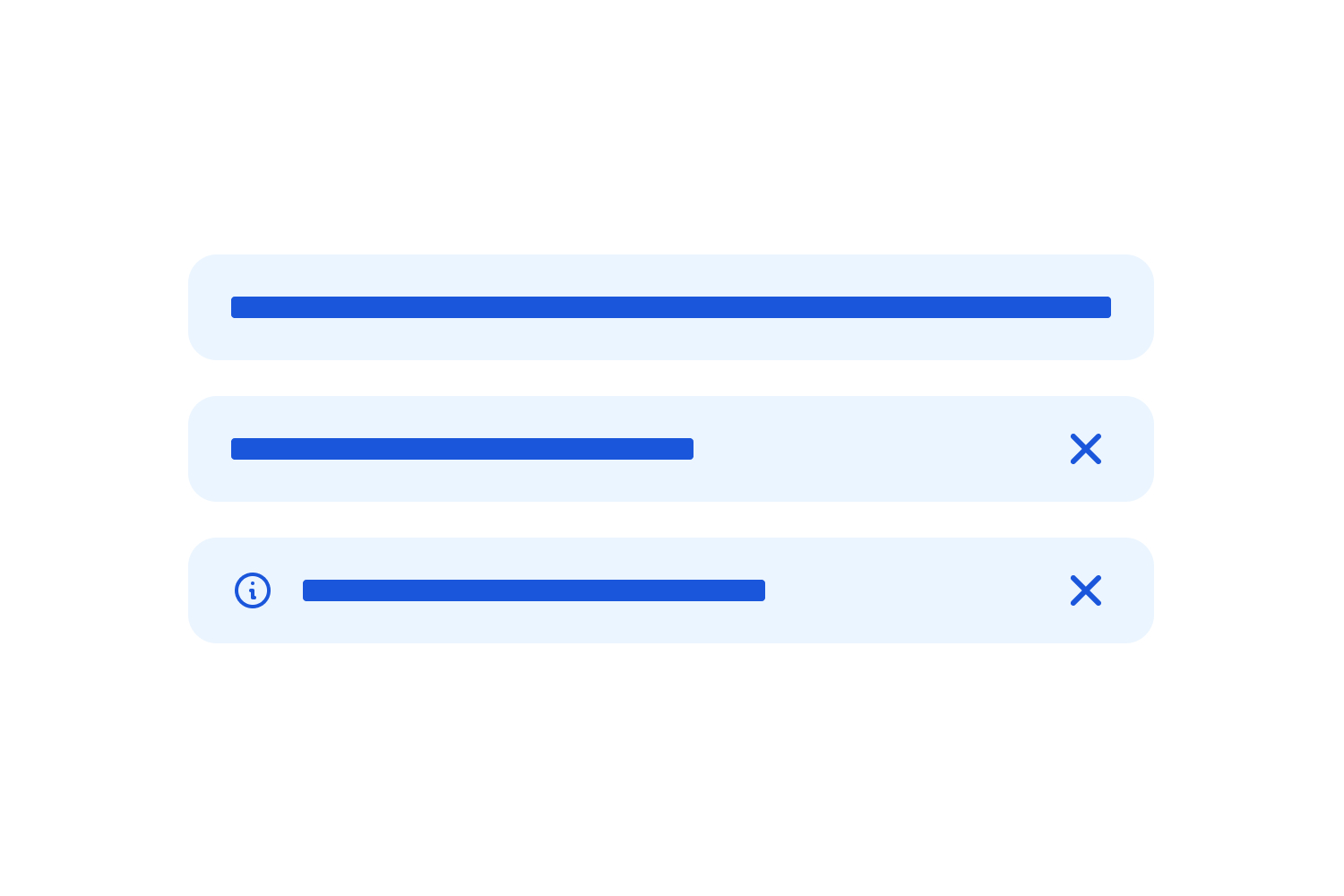
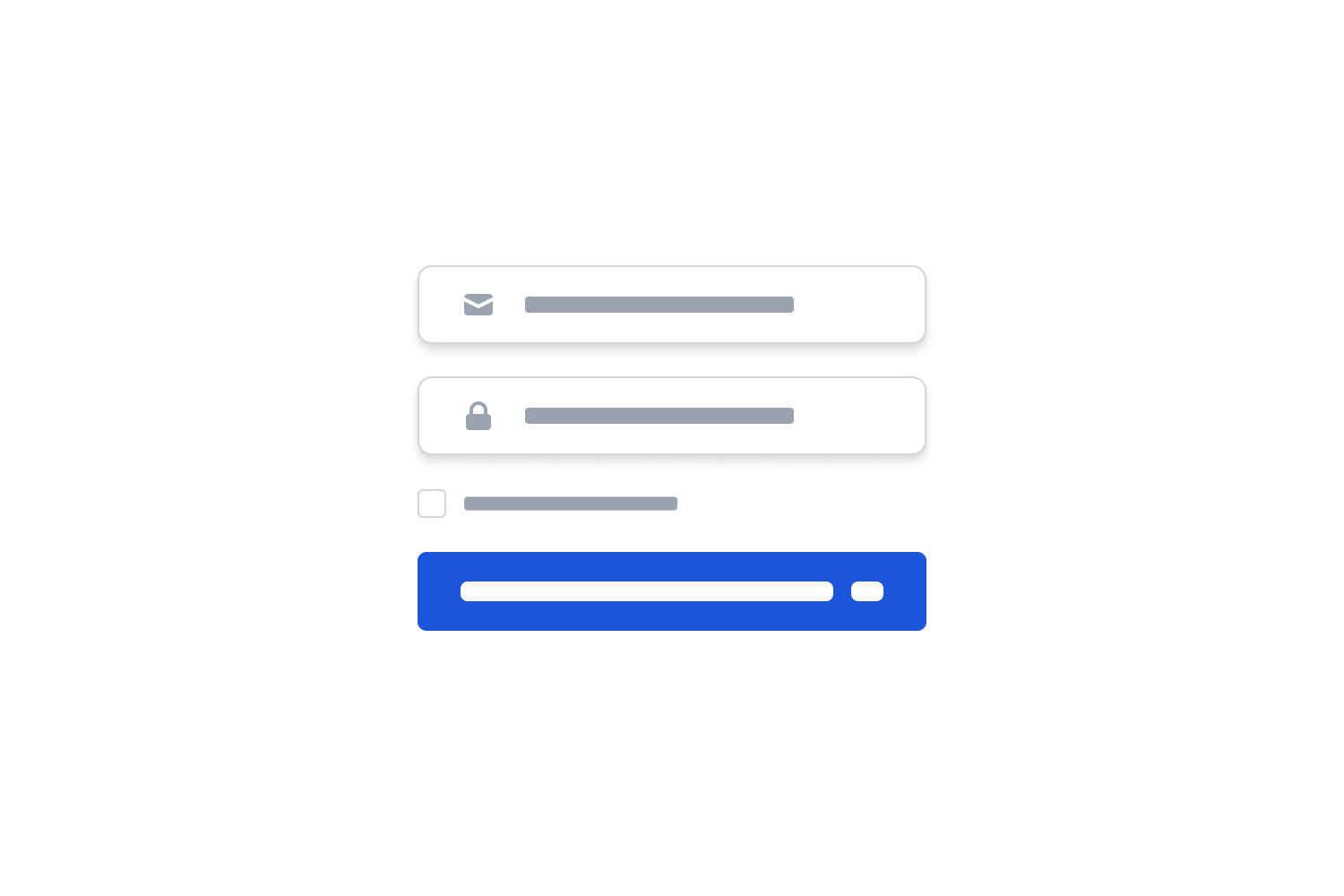
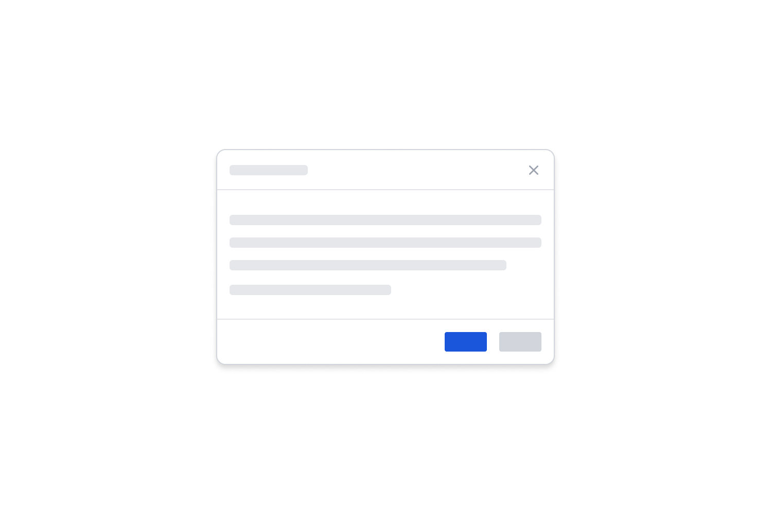
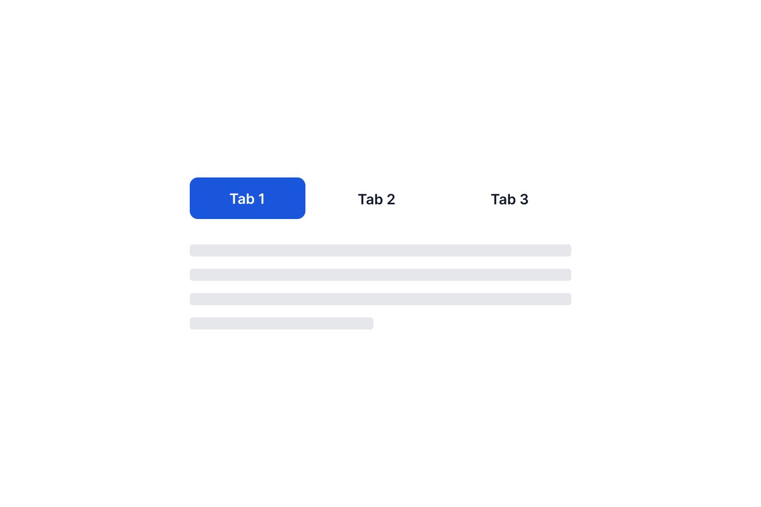
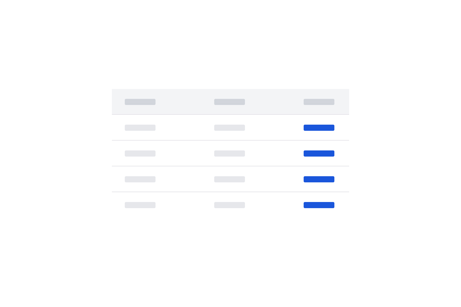
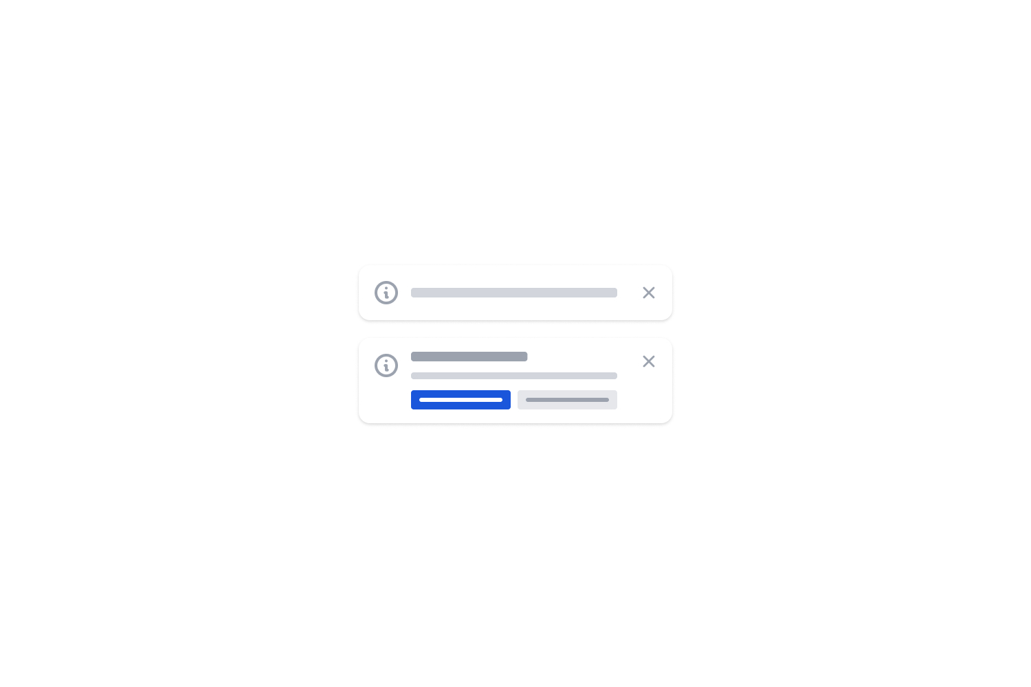
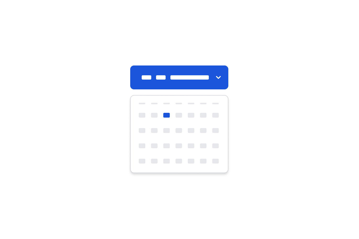
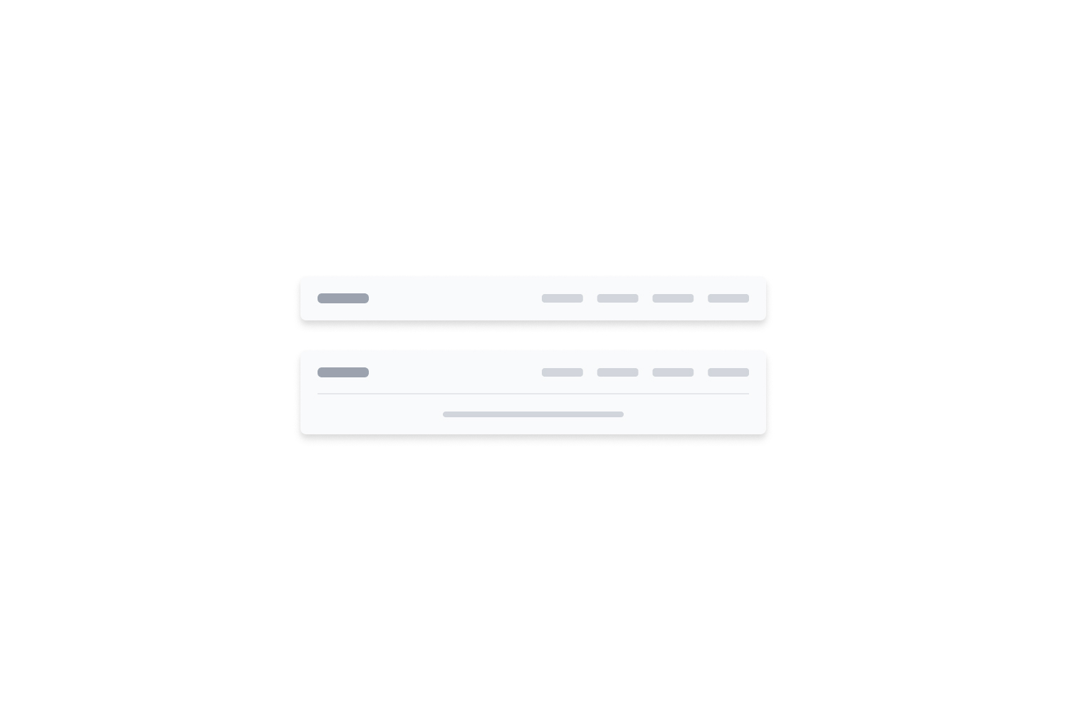
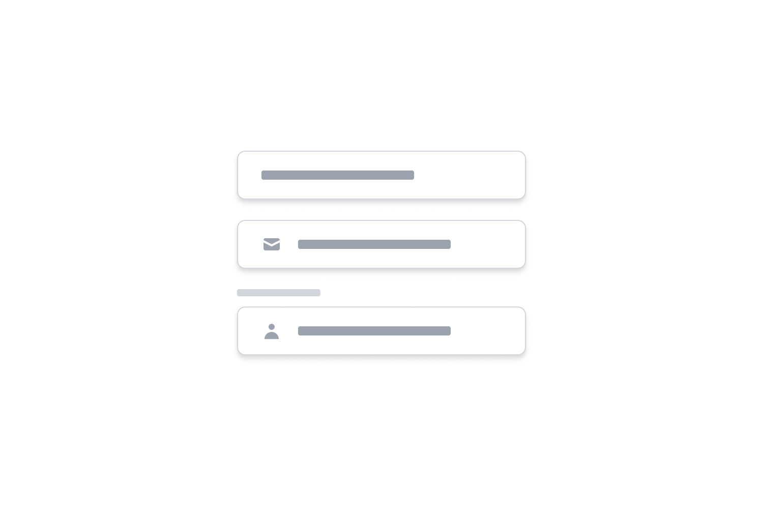
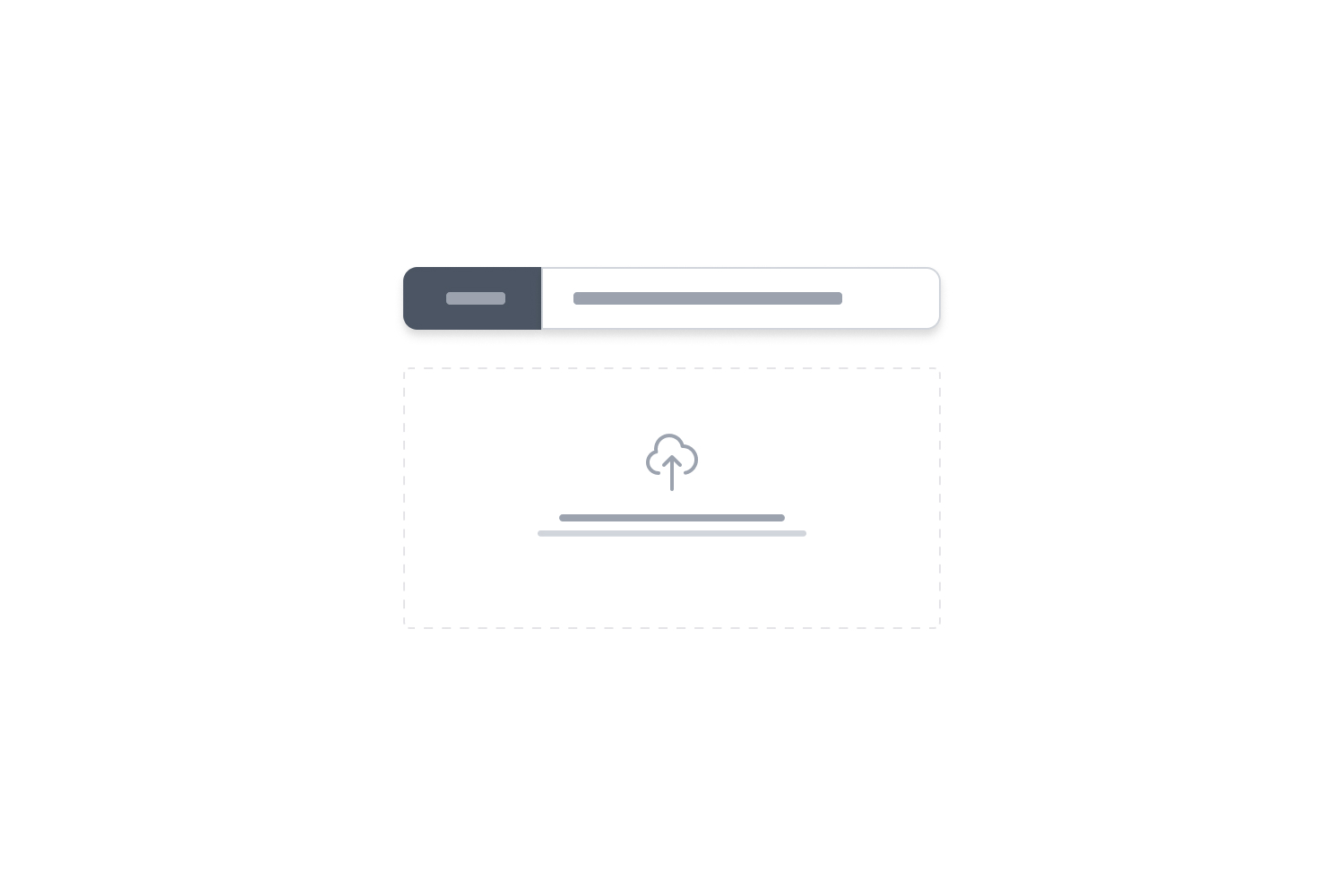
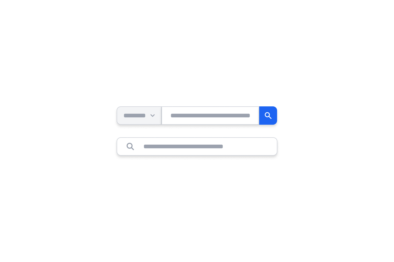
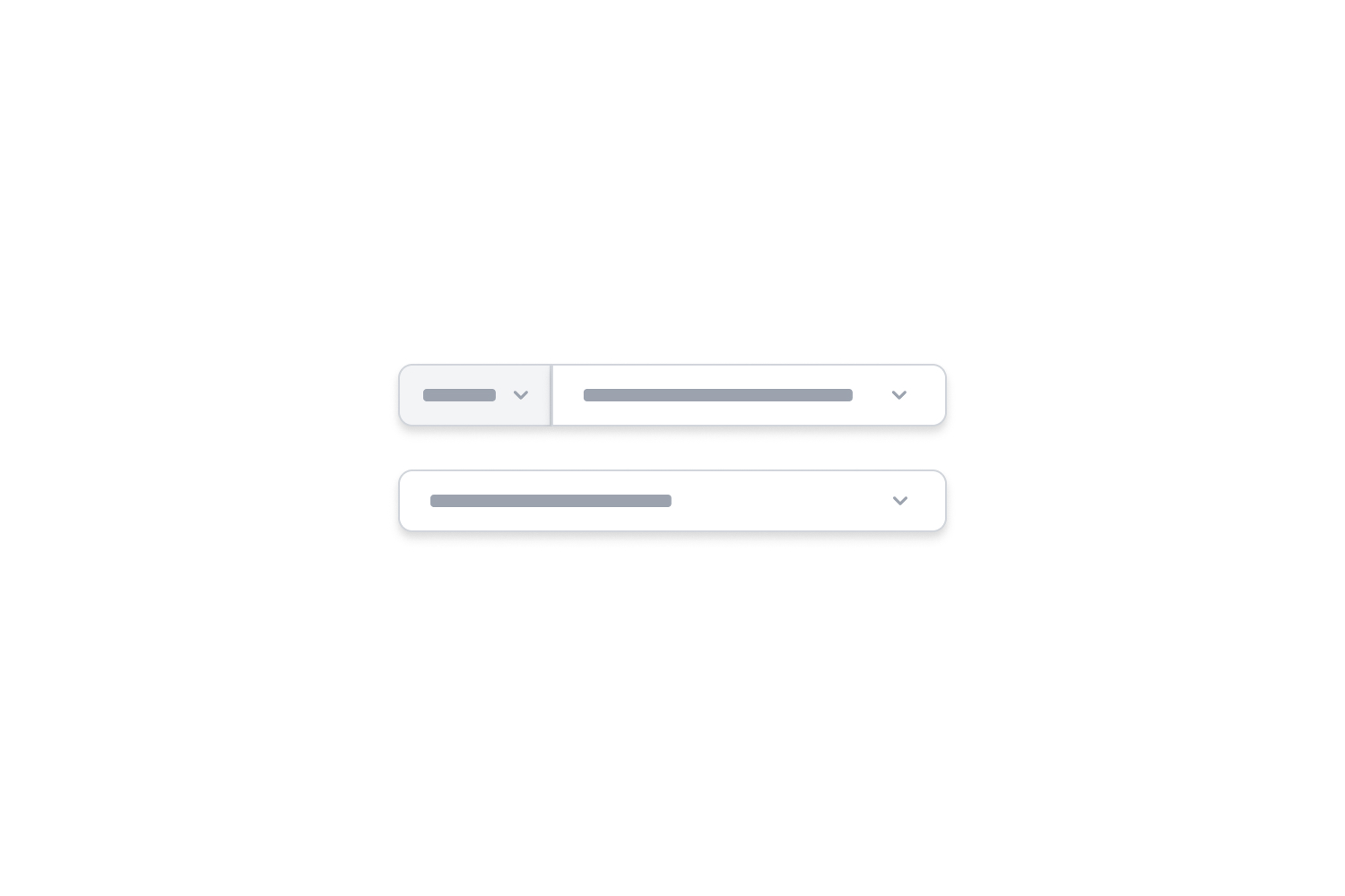
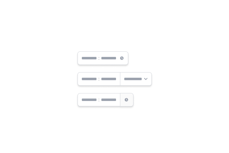
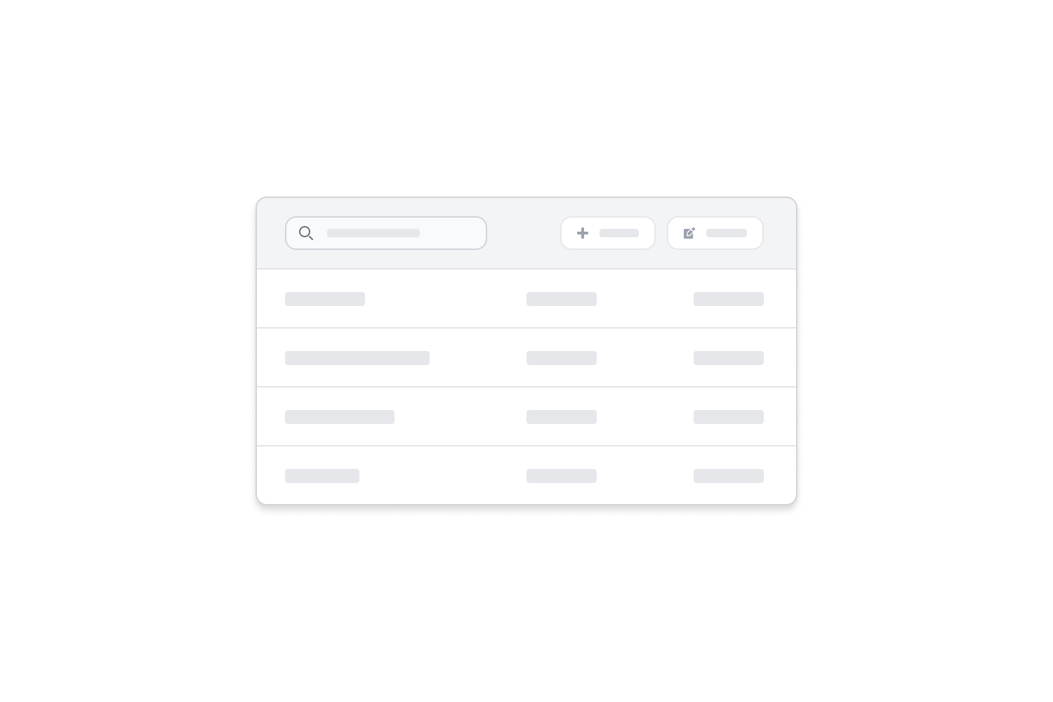
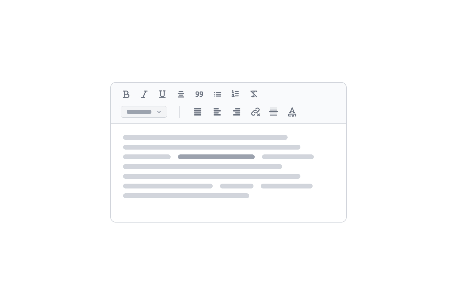
Flowbite는 Tailwind CSS의 유틸리티 클래스로 만든 오픈소스 UI 컴포넌트 모음으로, 사용자 인터페이스와 웹사이트를 코딩할 때 출발점으로 쓸 수 있습니다.





















Figma 디자인 시스템
컴포넌트의 Figma 파일이 필요하면 웹사이트에서 자세한 안내를 확인하세요.
Flowbite Blocks
Tailwind CSS와 Flowbite로 코딩된 웹사이트 섹션 400개 이상을 쓸 수 있는 Flowbite Blocks를 확인하세요.
Flowbite Icons
Tailwind CSS용으로 만든 450개 이상의 무료 오픈소스 채움 · 윤곽선 SVG 아이콘 모음을 쓰세요. Figma와 JSX(React)도 지원합니다.
🔍 아이콘 살펴보기
Flowbite GPT
Flowbite와 Tailwind CSS 자료를 바탕으로 웹사이트 섹션과 페이지를 만들어 주는 맞춤 학습 ChatGPT 모델을 개발했습니다.
Pro 버전
Figma 디자인 시스템, 모든 Flowbite Block 섹션, 대시보드 UI 인터페이스를 포함한 모든 프리미엄 기능을 이용하세요.
우리와 함께하기
애플리케이션을 한 단계 끌어올릴 준비가 되었다면, Flowbite와 Tailwind CSS를 써 온 개발자들과 함께 프로젝트를 진행할 수 있습니다.
🙋♂️ 우리와 함께 일하기
디자인 개념 배우기
더 나은 Flowbite 페이지를 만들고 싶다면 「Teach Me Design - Enhance UI」에서 디자인 기초를 배워 보세요. 색 이론, 타이포그래피, UI와 UX를 다루는 책으로, Flowbite 생태계를 최대한 활용하는 데 도움이 됩니다.
커뮤니티
도움이 필요하거나 라이브러리에 대해 이야기하고 싶다면 GitHub 커뮤니티에 참여하세요.
라이브러리를 쓰는 다른 사람들과 가볍게 대화하려면:
Flowbite를 쓴 영상 튜토리얼과 발표:
저작권과 라이선스
Flowbite 이름과 로고는 Bergside Inc.의 상표입니다.
저장소: themesberg/flowbite · 라이선스: MIT
평점
- 5점
- 0
- 4점
- 0
- 3점
- 0
- 2점
- 0
- 1점
- 0